
VOLT SUPPLEMENTS


The horse icon used in the VOLT logo is a stylized silhouette of a charging horse that is seamlessly integrated with the sharp, angular lines of a lightning bolt. The horse was specifically selected to represent raw, natural strength, endurance, and unbridled athleticism, serving as a potent symbol for high-performance supplementation.
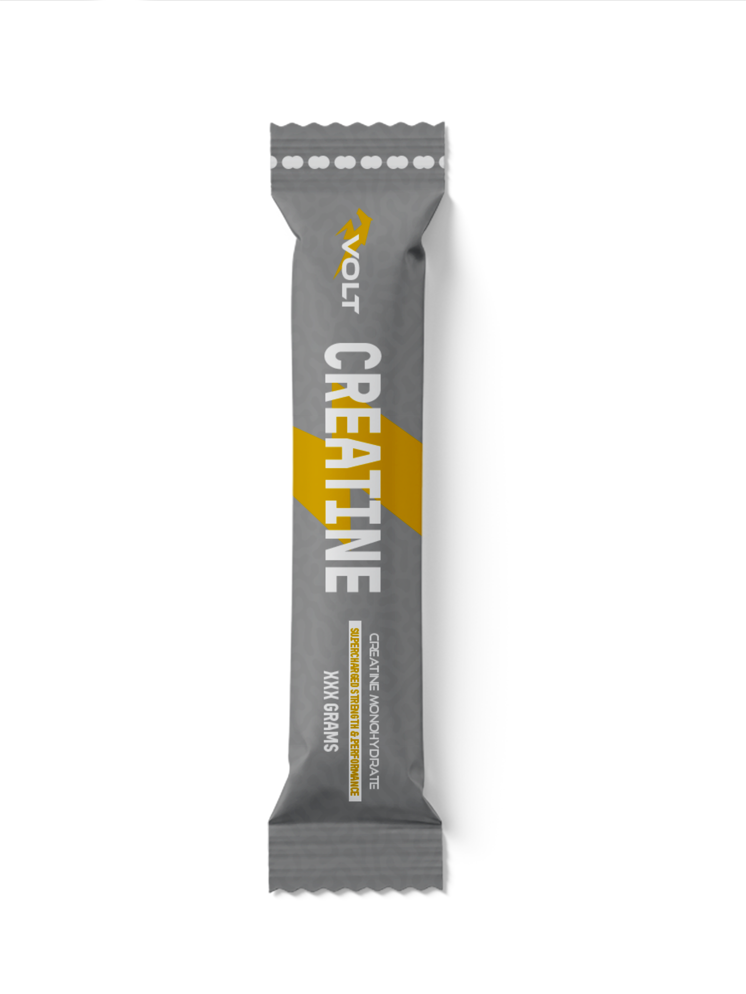
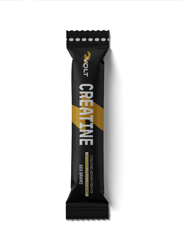
This icon is utilized as the brand's primary visual anchor, appearing in a striking yellow-gold finish at the top of all packaging, including individual sachets and bulk boxes. By merging the animal’s form with electrical imagery, the logo incurs a meaning of "supercharged" power, suggesting a fusion of biological force and instantaneous, electric energy designed to help users shatter their physical plateaus.
secondary element (thunder bolt)
The thunderbolt is utilized as a prominent secondary graphic element, appearing as a sharp, diagonal yellow-gold slash that anchors the visual composition of the packaging. This element was specifically selected to reinforce the brand name, "VOLT," and to provide a literal visual representation of instantaneous, electric energy and speed.
In terms of utility, this stylized bolt serves as a dynamic background for the primary "CREATINE" typography, cutting across the onyx and slate surfaces to create a high-contrast focal point. The use of this graphic incurs a meaning of "supercharged" power, suggesting that the supplement provides the explosive, kinetic force necessary for athletes to transcend their physical limits.

packaging
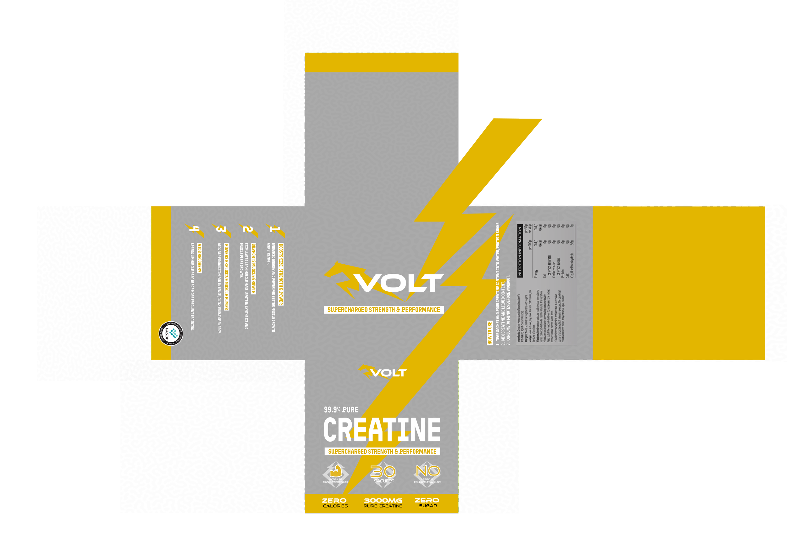
NET
faces
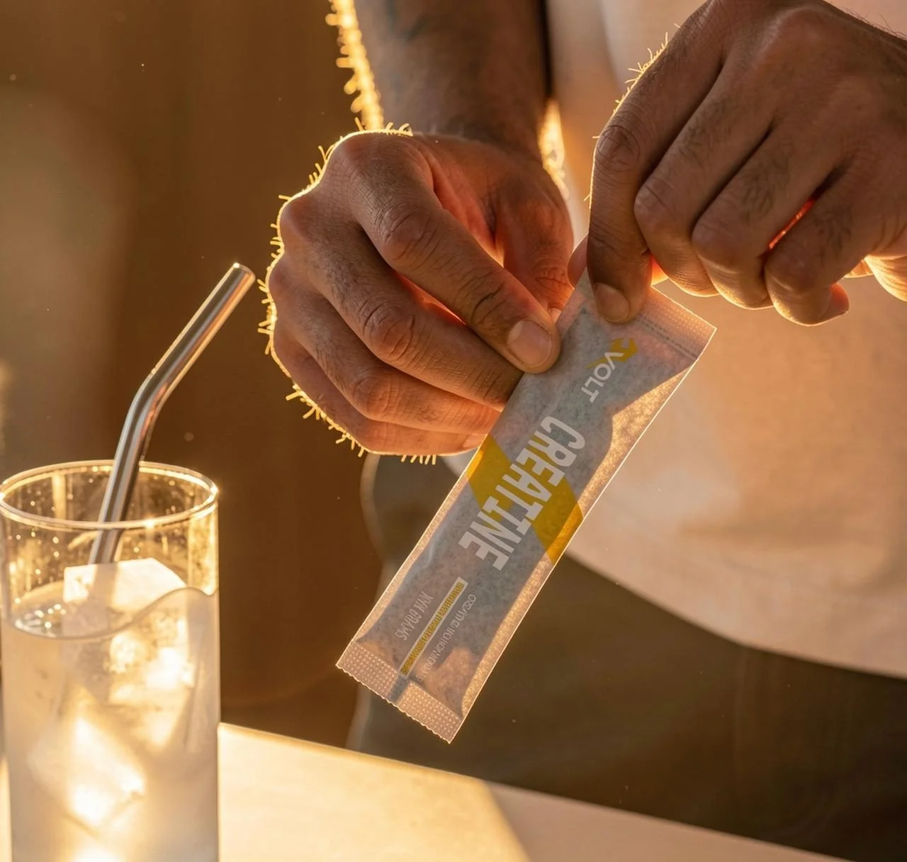
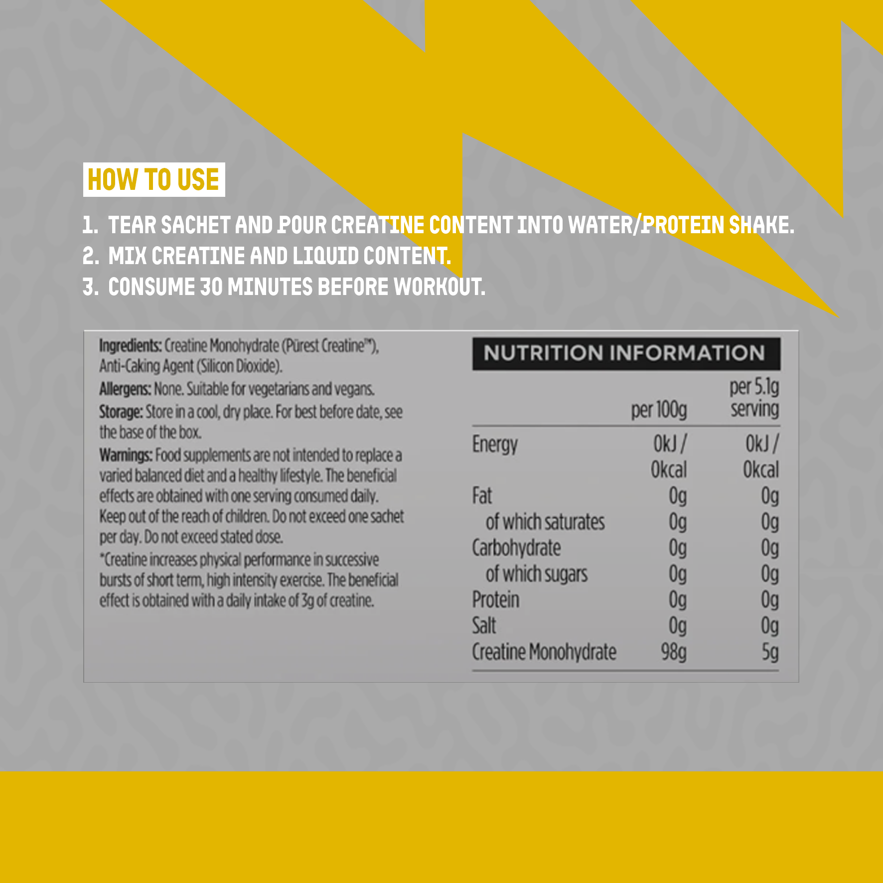
LEFT FACE
BOTTOM FACEmockups
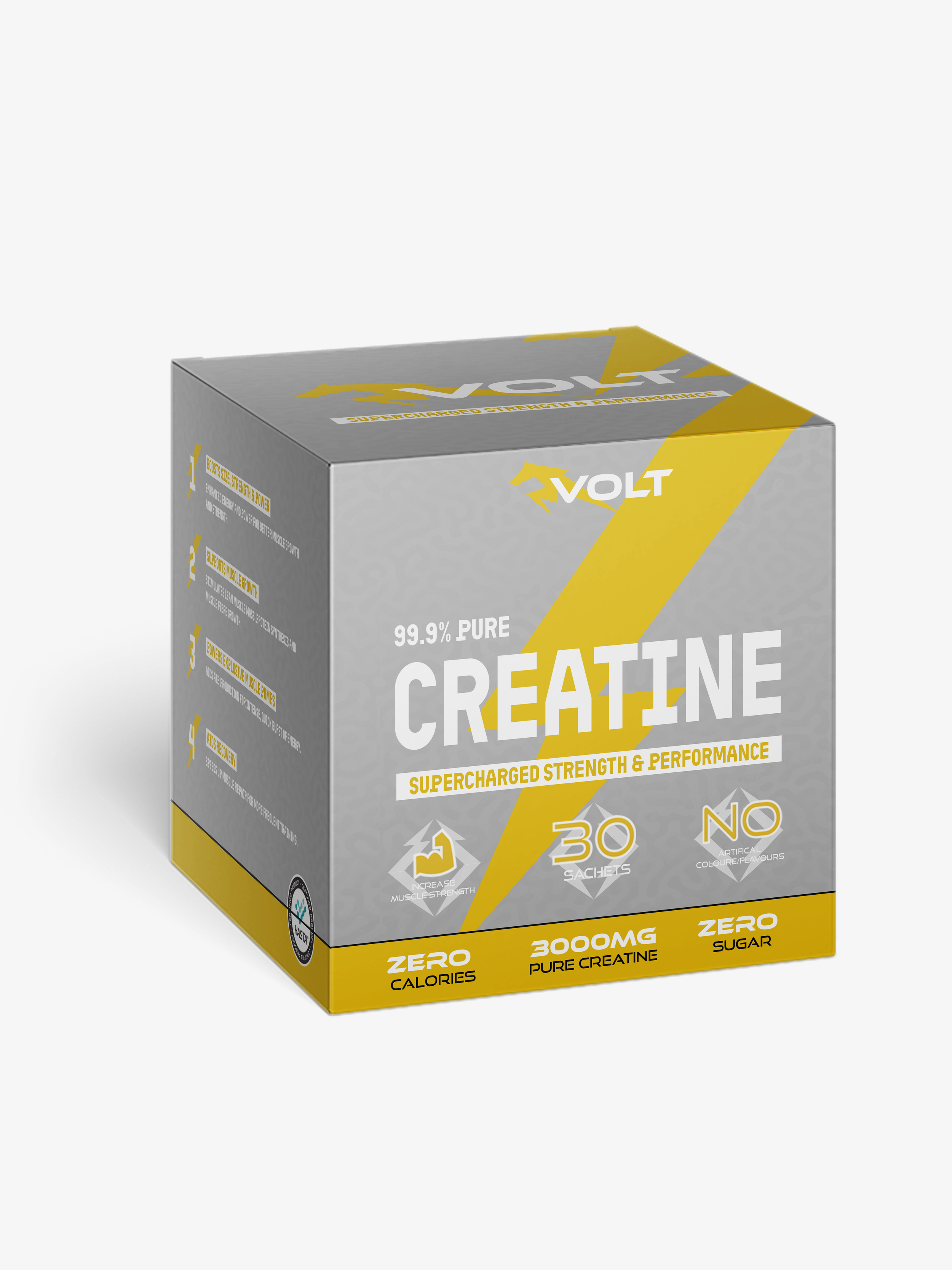
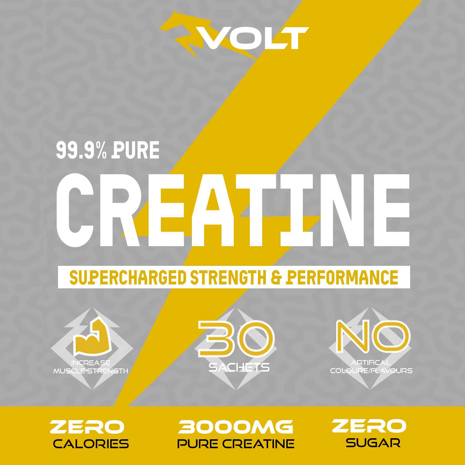
FRONT FACE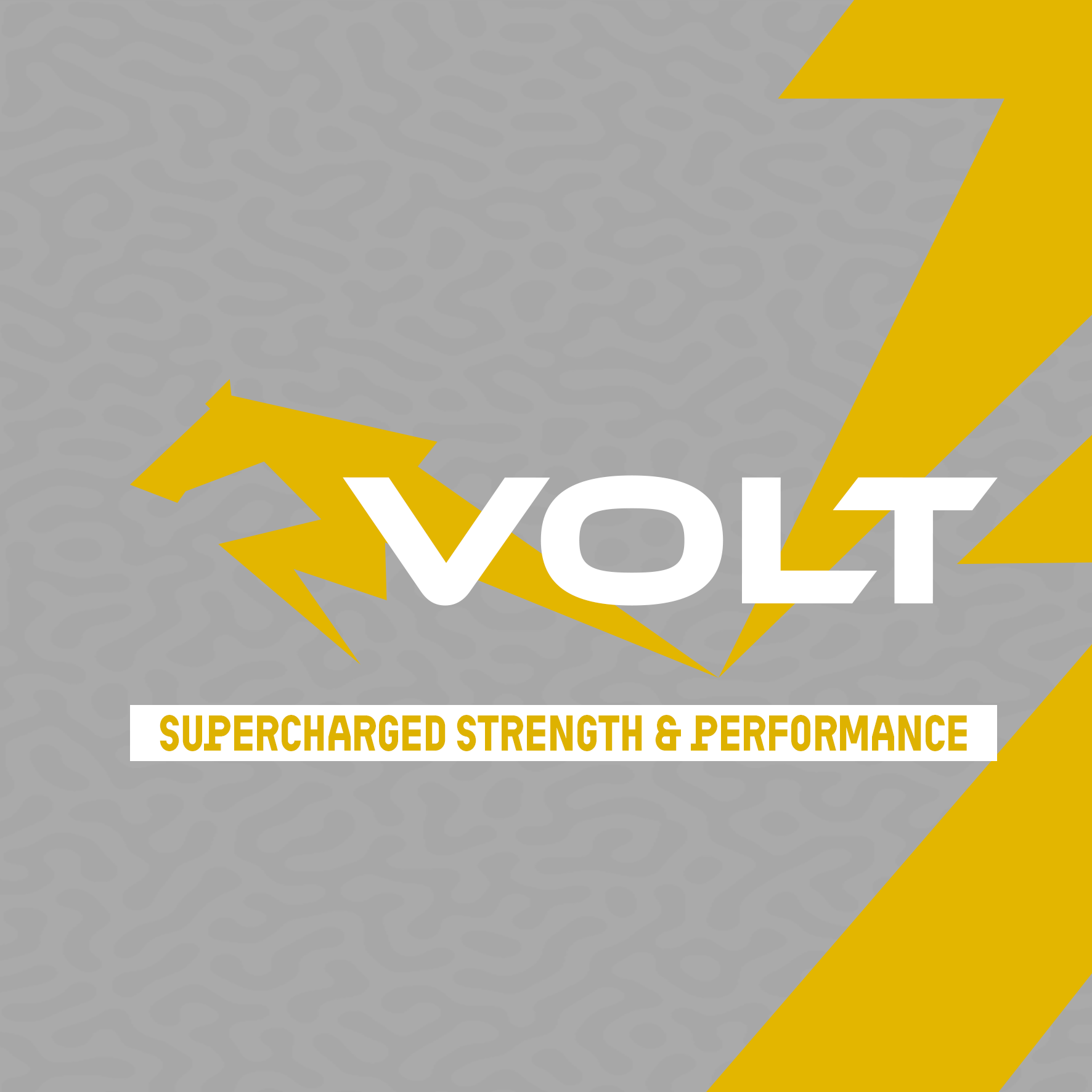
TOP FACE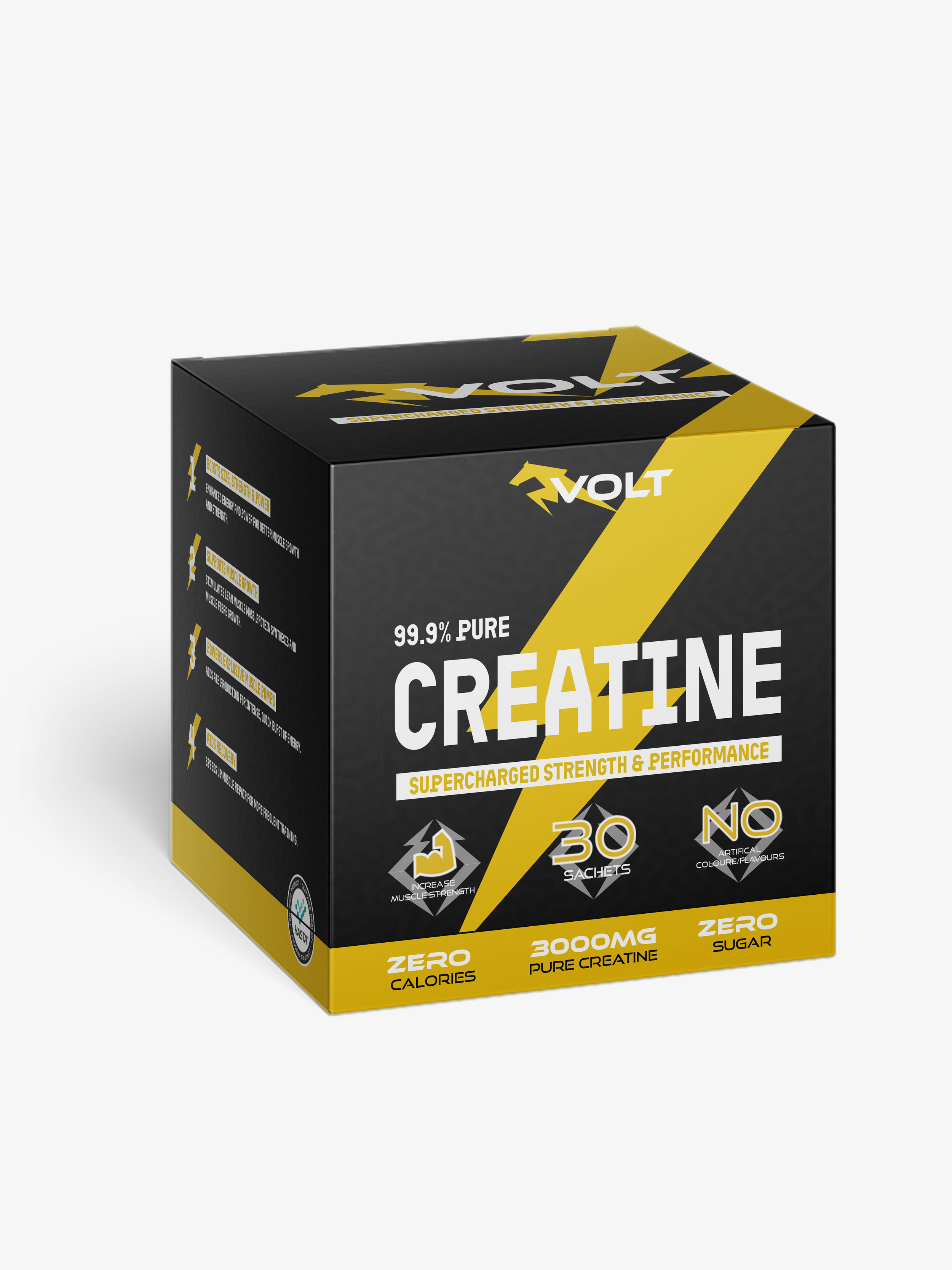
RIGHT FACEbrand identity
concept statement
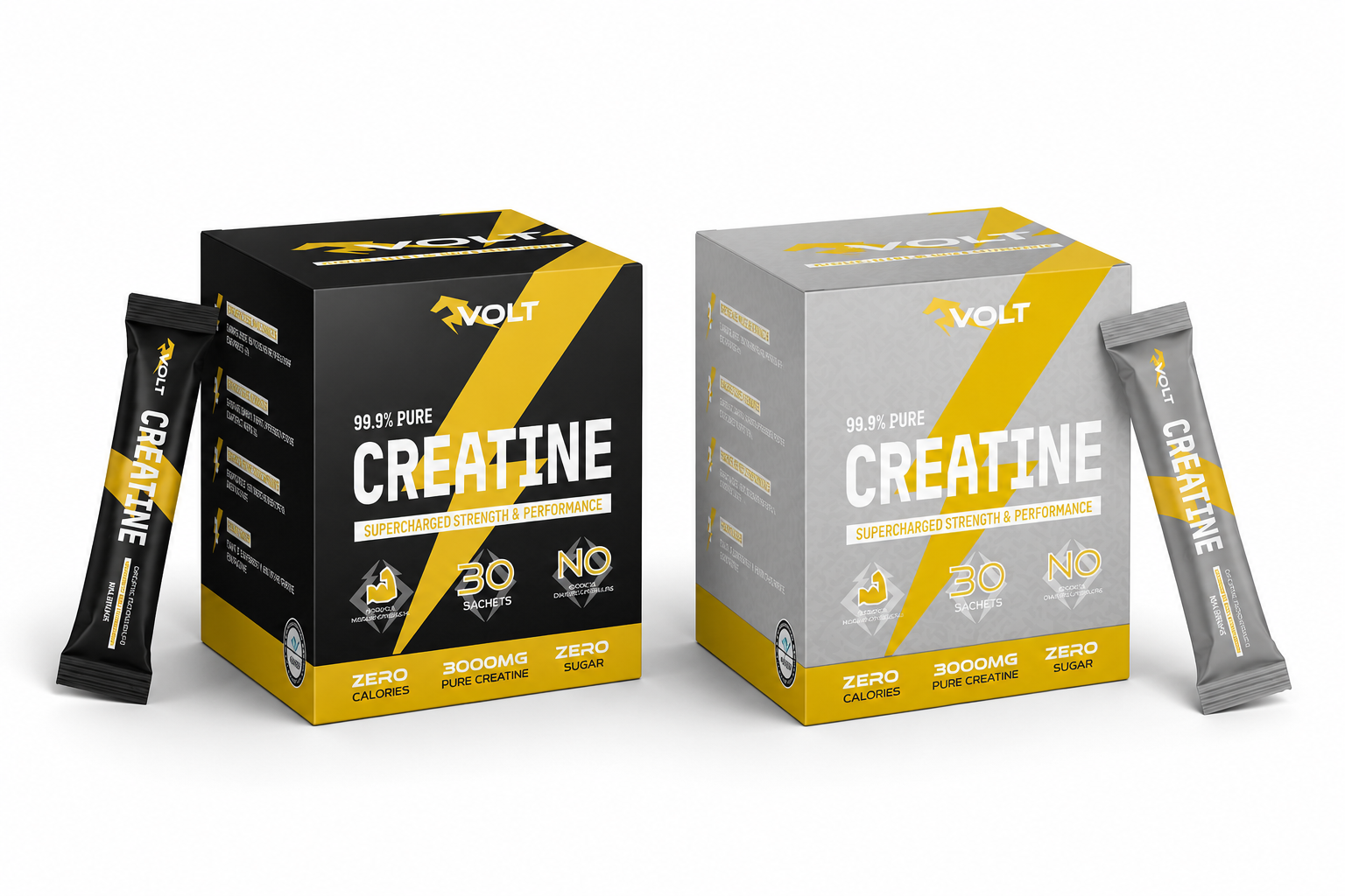
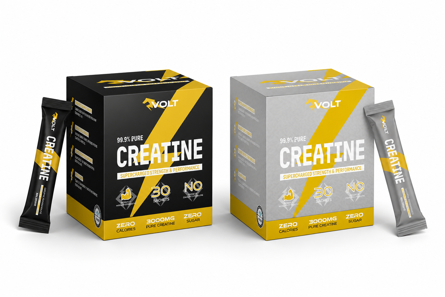
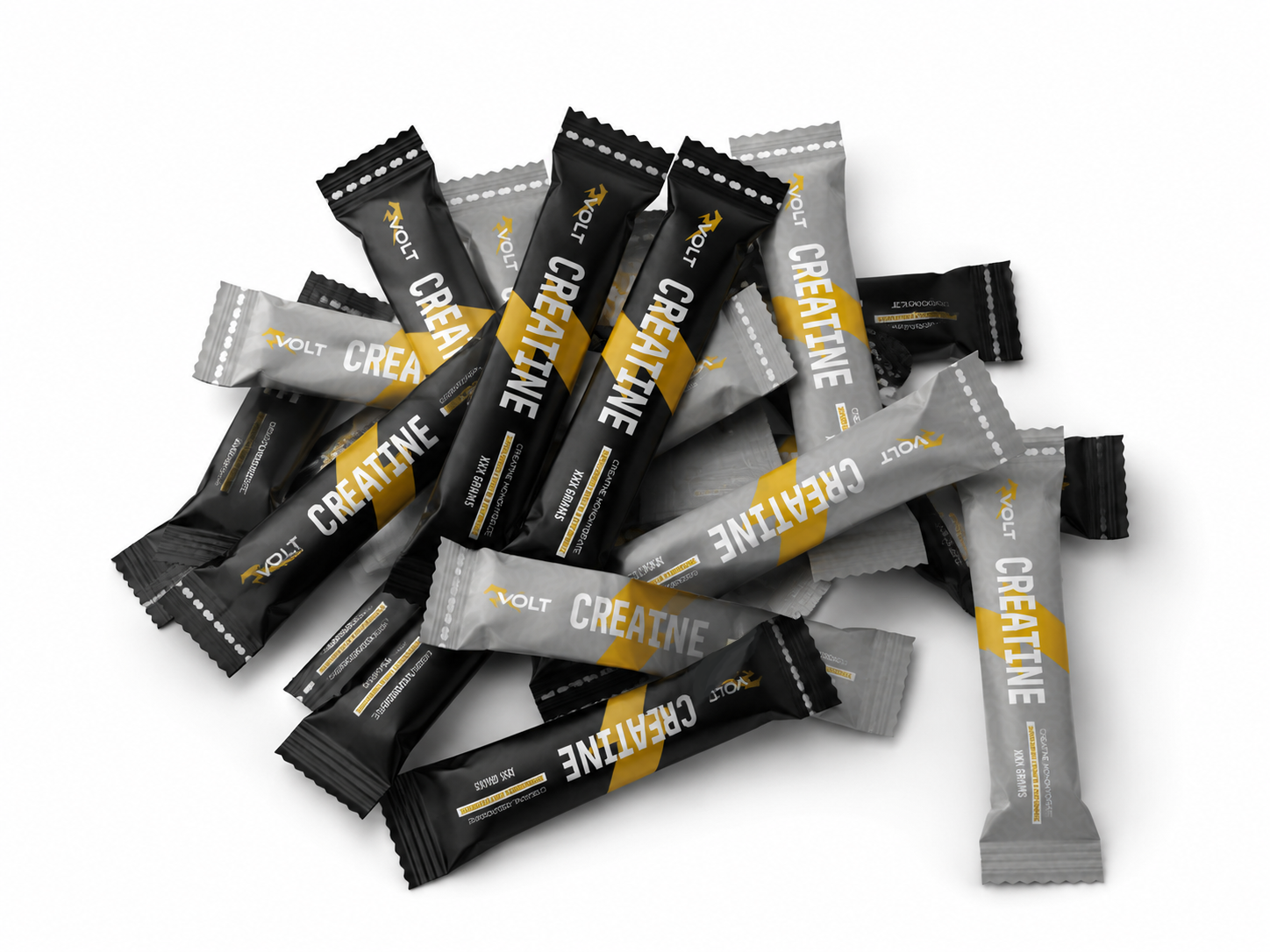
VOLT Supplements is a design solution for entrepreneurs seeking high-end, reliable dietary supplements that address environmental sustainability and nutritional illiteracy. Moving away from traditional HDPE tubs and plastic scoops—which damage the environment and lead to inconsistent dosing—VOLT provides pre-measured 3000mg doses of 99.9% pure Creatine Monohydrate in biodegradable sachets and boxes. This ensures a precise, eco-friendly experience that frees users from shifting intake levels and unreliable nutritional information. The brand’s visual identity mirrors this "supercharged" mission.
The yellow-gold logo fuses a charging horse with a lightning bolt, symbolising raw strength and electric power. Set against a high-contrast palette of onyx black and slate grey, the packaging communicates technical excellence through minimalist typography and clear "Zero Sugar" callouts. By combining laboratory-grade science with sustainable portability, VOLT Creatine offers a functional lifestyle brand designed to help athletes shatter physical plateaus while protecting the planet.

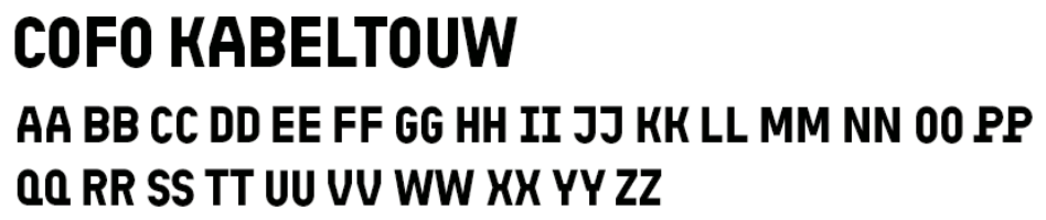
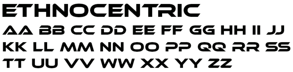
The typography of VOLT Creatine is a strategic blend of futuristic and industrial styles designed to reinforce the brand's high-performance identity. Ethnocentric is utilized for the primary "VOLT" logo and the bold "CREATINE" headings, selected for its wide, forward-leaning aesthetic that conveys a sense of speed, advanced technology, and kinetic energy.
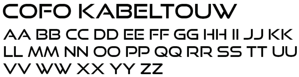
Complementing this, CoFo Kabeltouw is employed for technical details and nutritional callouts, such as "99.9% PURE" and "3000MG PURE CREATINE," providing a clean, geometric structure that incurs a feeling of scientific precision and professional reliability. Together, these fonts create a visual hierarchy that balances the raw, "supercharged" power of the brand with the transparency and clarity required for high-end, elite-tier supplementation.
graphic elements
primary element (horse)
COLOUR
primary colours
The visual identity of Volt Creatine is defined by a high-impact palette designed to communicate performance and purity. #000000 (Black) serves as the primary foundation, representing the brand’s premium positioning and aggressive, industrial minimalist aesthetic. This is contrasted by #e3b600 (Yellow-Gold), which functions as a kinetic accent representing "supercharged" energy and the electric, explosive power of the lightning-horse logo. Finally, #ffffff (White) is utilised for primary typography and technical callouts, symbolising the 99.9% purity of the product and the brand's commitment to clear, honest nutritional information.
#ffffff
#e3b600
The visual identity of Volt Creatine is defined by a high-impact palette designed to communicate performance and purity. #000000 (Black) serves as the primary foundation, representing the brand’s premium positioning and aggressive, industrial minimalist aesthetic. This is contrasted by #e3b600 (Yellow-Gold), which functions as a kinetic accent representing "supercharged" energy and the electric, explosive power of the lightning-horse logo. Finally, #ffffff (White) is utilised for primary typography and technical callouts, symbolising the 99.9% purity of the secondary colours for the package variations further refine the brand's professional identity through industrial and scientific cues.
For the black variation, the deep, monochromatic tones of #070707 and #080808, paired with the accent grey of #8f8f8f, represent uncompromising strength and elite-tier reliability. In contrast, the grey package variation utilises #d9d9d9, #A6A6A6, and #ABABAB to evoke scientific precision and laboratory-grade purity, reflecting the brand’s commitment to technical excellence and modern, clean supplementation. Together, these variations offer a sophisticated visual choice that aligns with the premium, high-performance lifestyle of the target athlete.roduct and the brand's commitment to clear, honest nutritional information.
Grey package variation
#d9d9d9
#A6A6A6
#000000
#ABABAB
secondary colours
Black package variation
#8f8f8f
#070707
#080808
typography

BACK FACE